Table Inspector
Legends
-
An important note
-
Not part of Cycle 3
Context
Users can access information and setting options for each table component using the table inspector, including columns, rows, and cells.
This is not a replacement for the cells’ context menu, it will remain as-is.
Design Goals
- Provide easy access to table component settings.
- Make features easier to discover.
Enabling and Disabling the Table Inspector
The table inspector can be enabled or disabled manually or automatically based on event triggers.
To manually enable the table inspector:
- Directly click on the inspector toggle located in the table toolbar to show the table inspector.
Some events will automatically display the table inspector:
- Navigating to a newly created table after completing the data import process.
- Navigating to a newly created table after completing the column extraction process.
To disable the table inspector:
- Directly click on the inspector toggle located in the table toolbar to hide the table inspector.
Persisting the visibility state
- The visibility state of the table inspector will not be saved in any persisted storage, whenever the user navigates to a table, it will be opened initially.
Positioning
When users enable the table inspector, a panel will appear on the right side of the screen, sharing the same container as the table and pushing its contents rather than being stacked on top of it.
In some cases, this will cause the table portion of the layout to have a horizontal scroll.
Inspector Modes
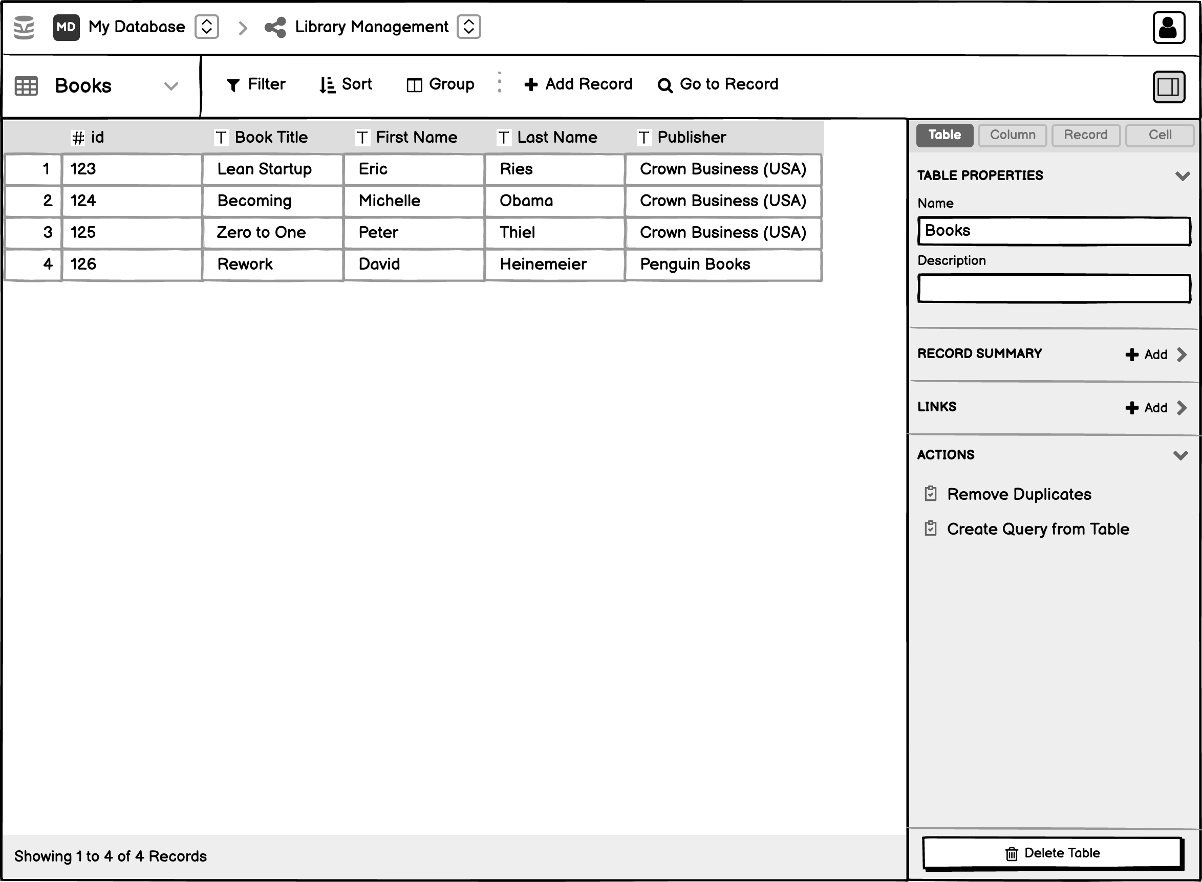
At the top of the inspector panel is a row of tabs. Each tab includes table component-specific attributes and actions.
The tabs are listed in the following order:
- Table (Default)
- Column
- Record
- Cell
Using the Table Inspector
The table inspector can be in exactly one of the following modes, available as tabs on the UI:
The mockups in the following sections has an “Edit Selection” button. This button will not be a part of the Cycle 3.
The mockups in the following sections contains a “Delete __” button. This button will not be fixed at the bottom rather will a part of the normal flow inside the “Actions” section
Table Mode
Shown when inspector mode is set to Table.
Properties:
- Table Name
- Table Descriptions
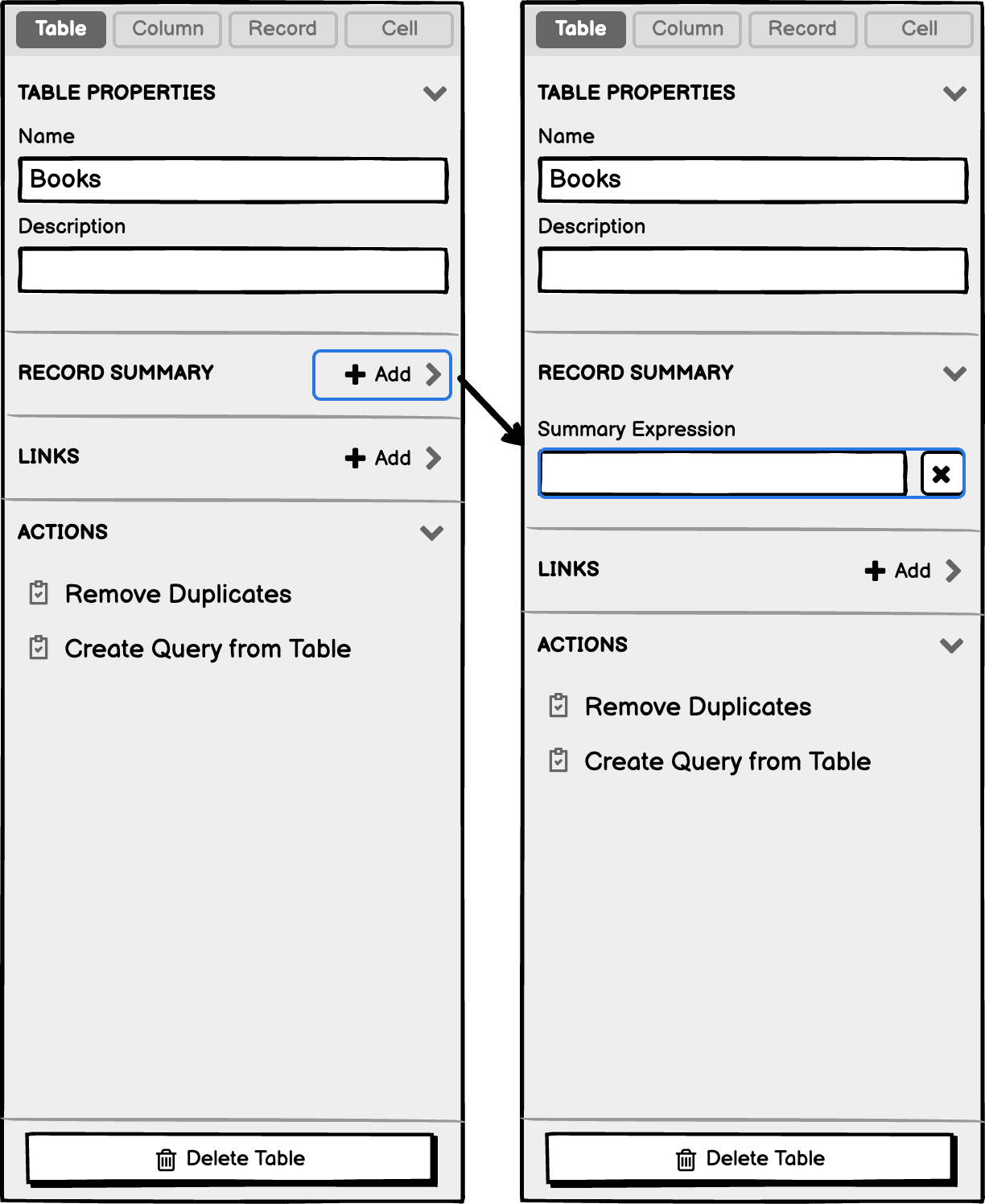
- Record Summary
- Constraints
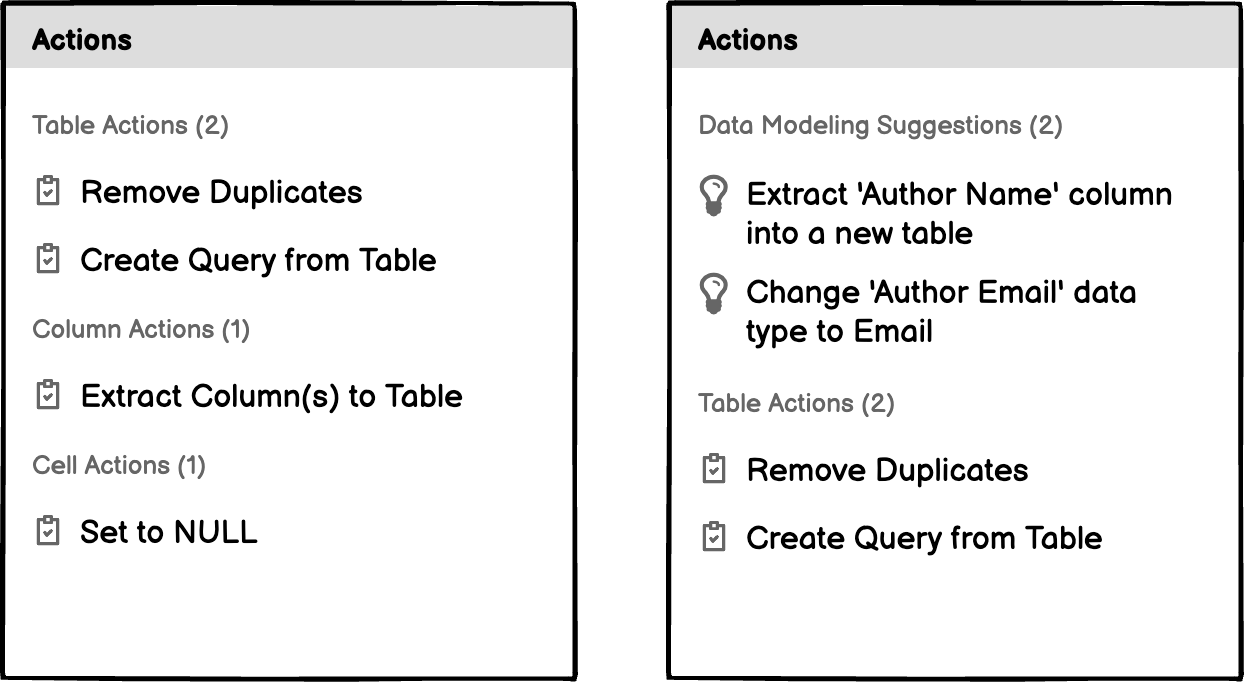
Actions:
- Remove Duplicates
- Link Table
- Explore Data
- Delete Table
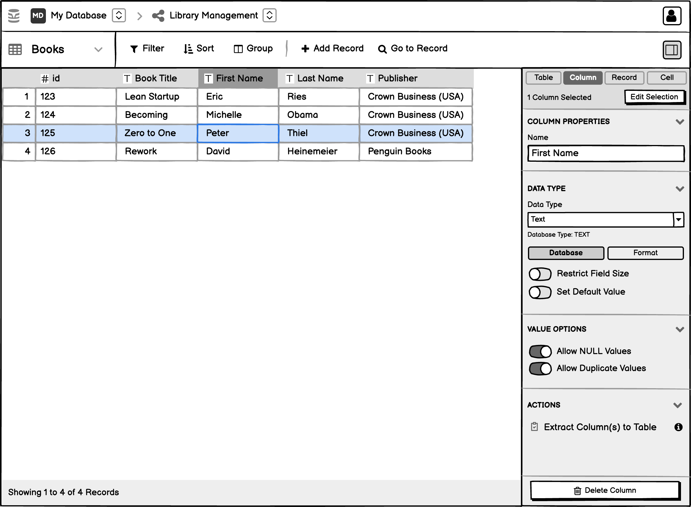
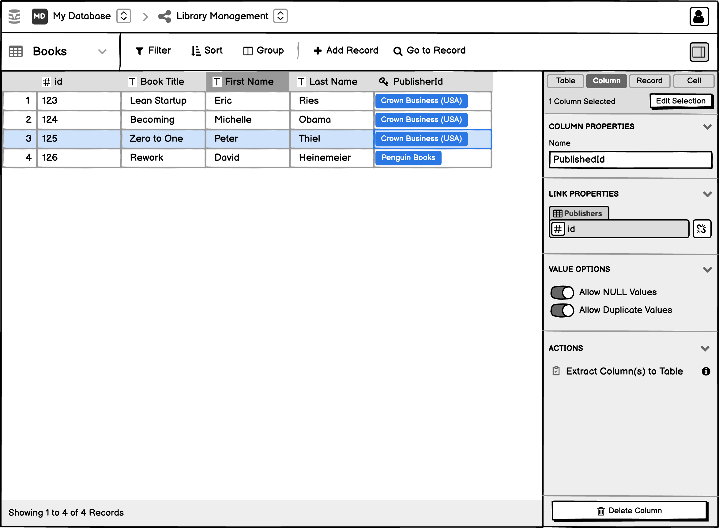
Column Mode
Shown when inspector mode is set to Column.
Properties:
- Column Name
- If Column is Link:
- Link Source
- Sorting
- Grouping
- Allow NULL
- Allow Duplicates
- Data Type
- Database Options
- Format Options
Actions:
- Extract Columns to Table
- Delete column
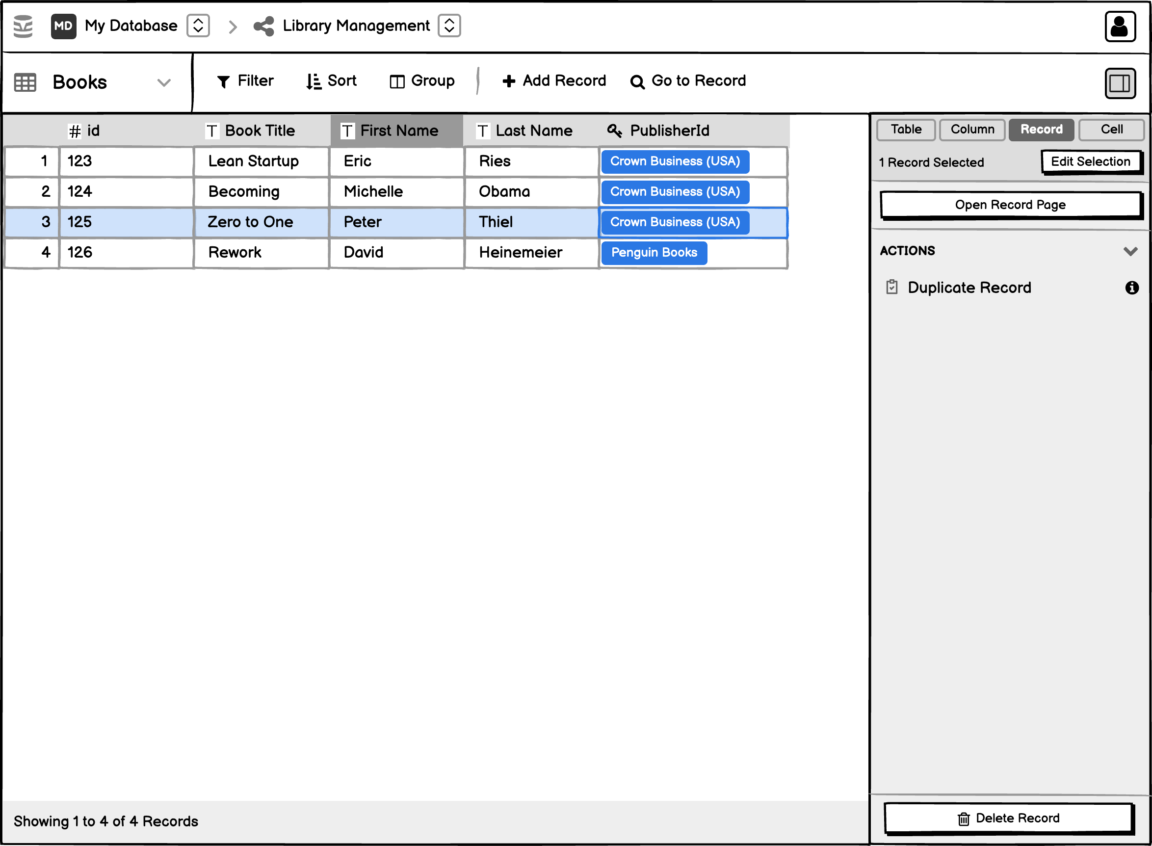
Record Mode
Shown when inspector mode is set to Record.
Actions:
- Delete Record
- Duplicate Record
Cell Mode
Shown when inspector mode is set to Cell.

User interactions inside a mode
The UI inside the modes can be divided into exactly two sections
-
Properties: All the UI of the interactions in the “Properties” section will be embedded inside the table inspector itself including all “Edit”, “Save”, and “Cancel” functionalities.
-
Actions: Interactions inside the “Actions” section will start a new flow by opening a modal/drawer which will require more inputs from the user.
Edit mode and saving the changes
Ideally any fields that do DDL operation should have an “Edit” button, then “Save” and “Cancel” button to persist or discard the changes. But for the sake speed in this spec, any operation DDL that currently works without a “Save” button should continue to do so.
Inline saving and editing requires the implementation of new UI interactions so that the user can toggle the ‘Edit’ mode and save or discard the changes. Details on this are provided in the Inline Saving Spec spec.
- Any operation that currently has a save button should have a “Save” button and an accompanying “Edit” button.
- The operations that currently do not support a “Save” button will remain a single-click operation.
Actions for Multiple Components and Selection Status
Some actions can be performed on multiple table components at once.
-
With respect to Cycle 3, the only multi selection “Action” available will be “Column Extraction”.
-
The number of table components selected will be reflected in the selection status at the top of the panel.
Actions Panel
The actions panel provides users with ready-to-use actions for quickly manipulating tables, columns, or cells. The available actions are dependent on the active inspector mode.
The actions, when clicked, should open a modal dialog with the corresponding action options if applicable. They should not include options directly into the table inspector.
Future Considerations
I think the ‘Actions’ panel could include the data modeling suggestions in the future. It could also include shortcuts to create queries that include the filters set in a table or the group options into a summary.
Selection Modes
The selection will always be cell-based. Based on the range of selected cells, the inspector will display the corresponding properties for the related table components, like columns and records.
This means that selecting a column, triggers the selection of all the cells in the column. The same goes for selecting a record, which triggers the selection of all the cells in the record.
- The selected rows and columns are derived from the rows and columns that contain selected cells.
- Row headers and column headers are styled to visually indicate the selected rows and selected columns.
- Unselected cells do not receive any special styling, even if they fall within a selected row or selected column.
Multi-page record selection
Multi-page record selection in the current state is only used for deleting non-contiguous records across multiple pages. This spec discontinues this functionality which will mean that the user has no way to delete records across multiple pages until we do more design work at some point in the future.
To Select All
- Clicking on a row header selects all the cells within that row.
- Clicking on a column header selects all the cells within that column
To Deselect
Deselect all selected items by clicking on a currently selected item, or on an empty space.
Extending a Selection
We may consider including a “Selection” area in the inspector so that users can change the selection they’re currently working with.
This section could contain options such as:
- Extend selection
- Select all
- Select all columns with the same data type
Keyboard Controls and Touch Devices Considerations
Users would be better served if the software could support keyboard controls. We’ll look at how the inspector options are accessed and updated using the keyboard in a separate issue. We’ll also look at how multi-object selection works on touch devices.
User Interface Considerations and Examples
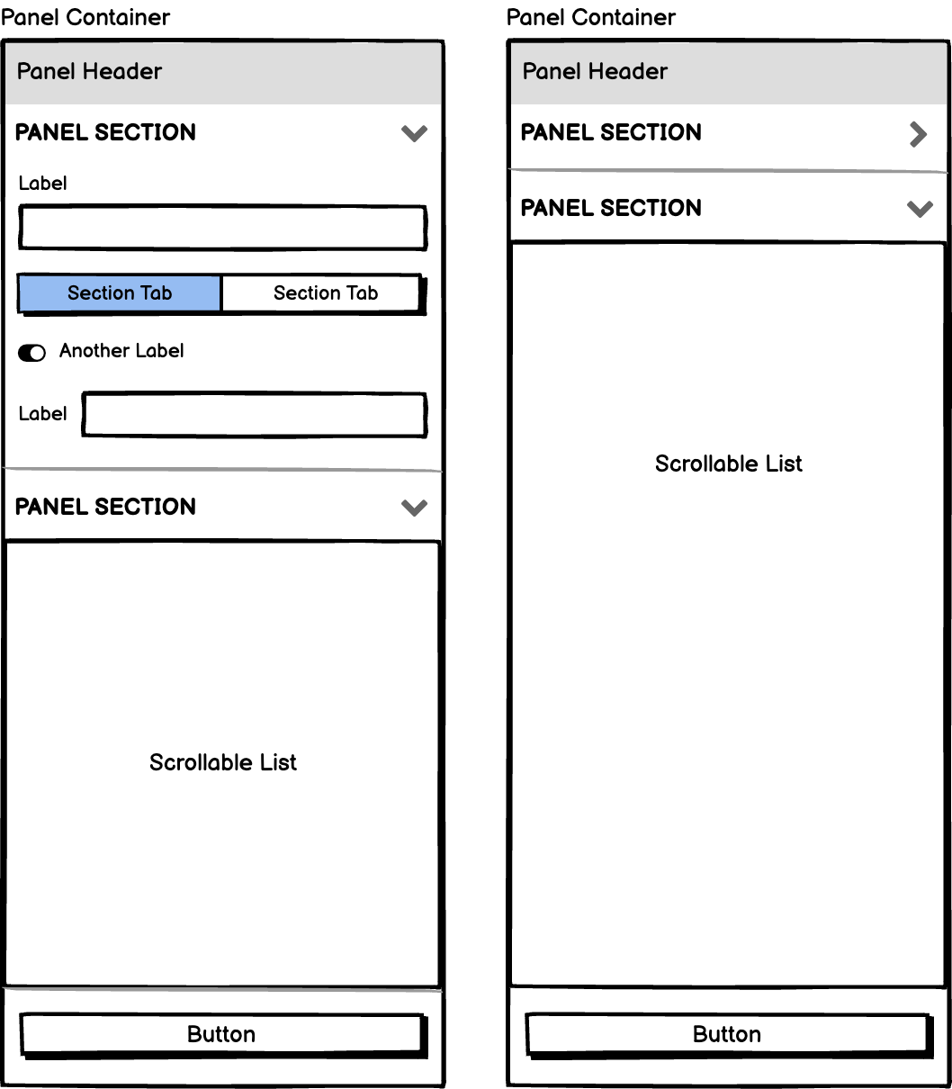
Collapsible Sections
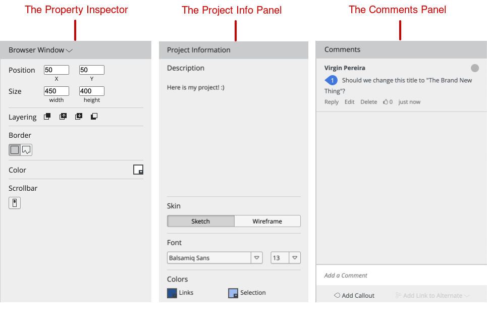
To make the table inspector’s user interface more flexible, it should have expandable parts that can be collapsed and scrolled to.
Examples
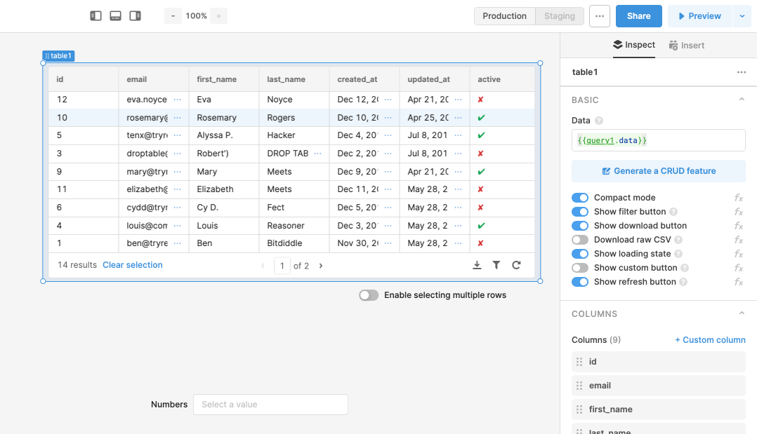
Retool
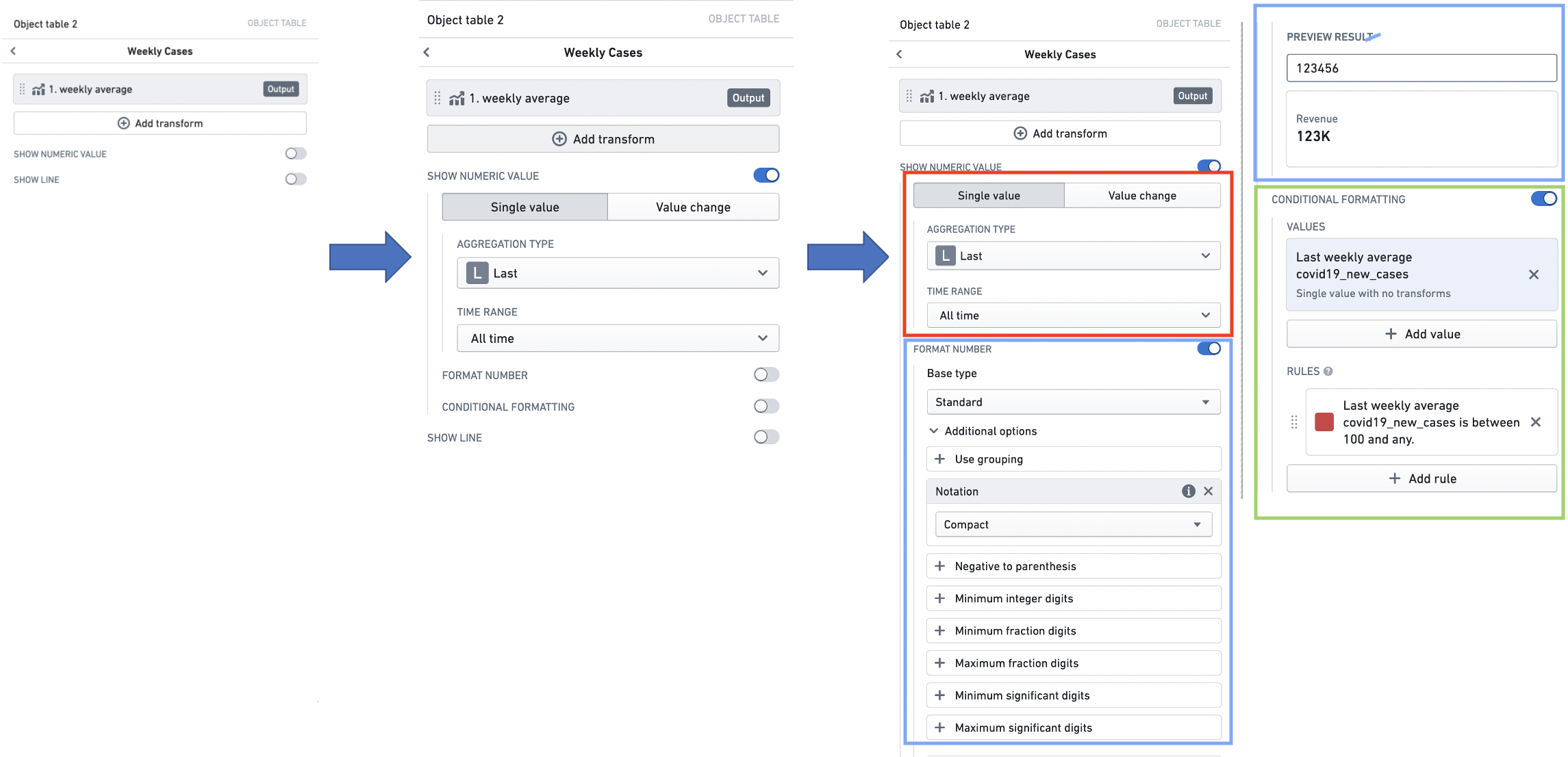
Palantir
Balsamiq