Read Only Table Spec
Information
See the related Figma prototype
User Experience
Impact
Read-only tables the first step towards having an interactive table component. Tables, in general, will help Mathesar users to make sense of their database records, as they will be able to inspect them and manipulate them without the need to perform complicated queries.
Tables are also used to represent data in other views, such as import of data from files.
Interactions
Browsing multiple tables
Not covered yet
Overflowing content
When tables exceed the number of rows that can fit in the viewport, the user will have to scroll in order to reveal the hidden content. Scrolling is preferred over other methods of showing partial content, such as pagination. because it’s less disruptive and also because some of the spreadsheet-like interactions only work if the user is able to perform actions on rows that might not be simultaneously visible.
User Interface
Components
Table
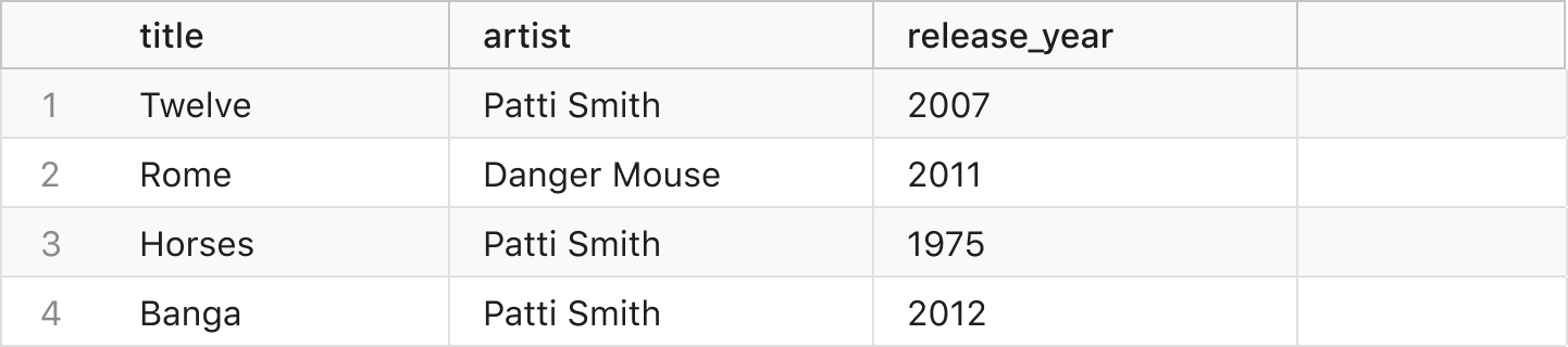
The table component uses columns and rows to display data in a grid.
Read-Only Variation
A read-only table only serves to display data but has no other interactions. Users can read or select the data that is displayed in the table rows but they can’t modify or delete data.
Other uses:
- For data preview during import
- For a tble with no permission to edit
States
Not covered yet
Behavior
Not covered yet
Tabs
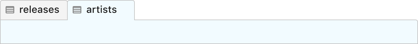
The tabs component allows navigation between related groups of content. The tabs can represent table or view content types in their open state.
Tabs allow only one instance of a table to be open at the same time. If the user navigates to a table that is already open, the corresponding tab will be activated.
To consider:
- AWS Athena and how they handle multiple instances of a table.
- Working on views without saving them so that user can discard them easily.
States

When the content of a table or view is visible, the corresponding tab will have an active state. Based on the type of content represented by the tab, there will be a different icon displayed next to the content name label.
Behavior
- It is possible to have multiple tabs open at the same time, however there can only be one active tab.
- Tabs should take into account width settings that avoid sub-optimal target sizes that could impact usability. See the example below for ‘New Tab’. Additionally consider how longer names are truncated.

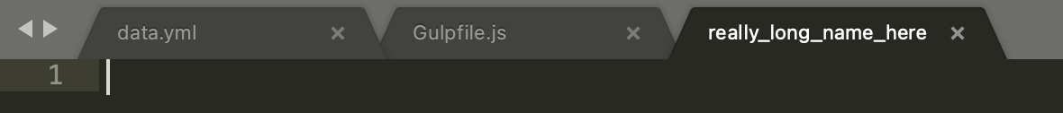
- A control to close tabs should be available on each tab.

Notes:
- In future iteration maybe tabs can be reordered by drag-and-drop interaction.
Sidebar Navigation

The sidebar navigation component allows navigation between different content groups displayed in the sidebar. Unlike the tabs component, the elements cannot be reordered or closed.
States
The sidebar navigation contains various navigation levels in a text-based hierarchical form which can be expanded or collapsed.
The navigation controls to collapse or expand contain arrow icons as indicators of their state. When collapsed, the nested groups are hidden. Expanding shows the subsequent level content group. A level might contain only controls and no content, in that case an additional interaction is required to get to the next level of content.
All items, including the group headers, change style on mouse over. The trigger area should expand until it fills the available horizontal space for optimal target area
For content that exceeds the available space, labels should be truncated and a tooltip available to view full details.

Behavior
On launch, and if no content is active, the sidebar navigation is displayed with all the levels collapsed. The main content area is also empty with no tables opened. An empty state is displayed when no tables are open.

On reload, the navigation level states should persist.
What is expanded or collapsed should also persist if a higher level state changes.
Questions:
- Can a schema contain no tables?
- What’s the sorting criteria for the sidebar navigation groups?
Future Idea:
- Additional list group to show recently updated tables
Views
Data Browser / Table View
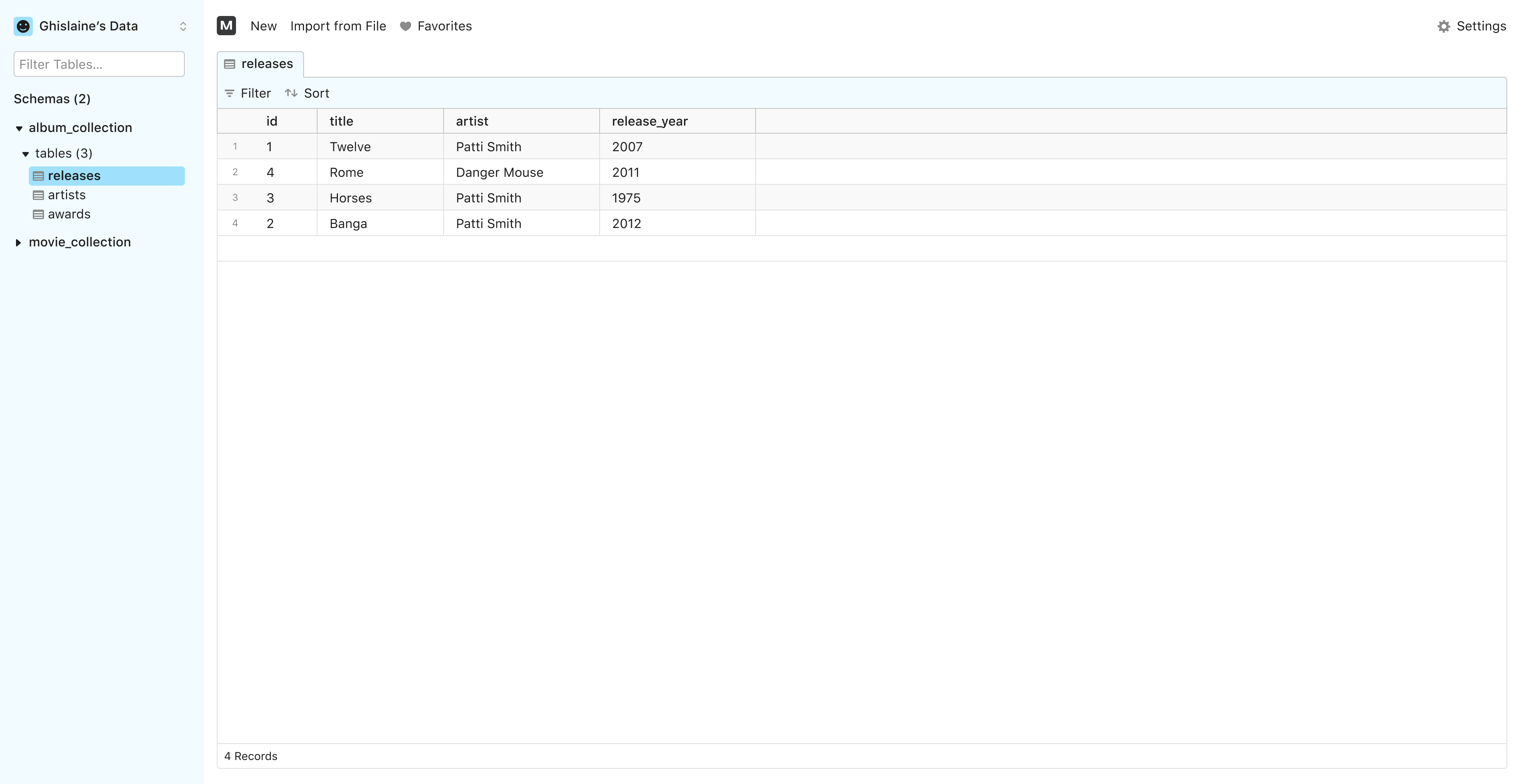
The data browser or table view is where most of Mathesar’s functionality is accessed and used. The sidebar at the left allows users to navigate to tables and views. The right area is where content is displayed, in this case the content of tables and views.
Panel-based Content Area
The content area will contain most of the interactive elements that make the core user experience of Mathesar. In some cases, it will require additional functionality to be present as the user works through different tasks. In other cases, the content area may have enhanced functionalities that are not visible to the user while they are working through a task but can be displayed according to certain interactions, such as a record form, or other widgets. For this reason, we want the main content to support a multi-panel layer, making it easy to mix different widgets within the same area. This will also help to make Mathesar more extensible in the future, as new functionality can be added without breaking the existing layout.
Sidebar Area
The sidebar area will contain the main navigational controls for Mathesar. This area will also contain some account and user information, as well as options for account-related actions, such as logout. Unlike the main content area, the sidebar area doesn’t include any widgets or functionality related to data manipulation. However, it will be possible to delete, rename, and create schemas and tables from the sidebar, as well as searching the content of these objects.