Filter, Sort, and Group Tables
Figma Prototype
Context
In the Inventory Use Case, the user is presented with problems requiring them to make sense of the data and then making decisions, i.e., creating a summarized view of multiple tables. We need to display these data views within Mathesar using the filter, sort, and group functionalities.
Considerations
Database objects
Within Mathesar, we opted to show most database objects such as tables and views to the users. This approach ensures that the user can understand the database schema and progress through the various steps of database normalization.
Table objects
Table objects give the user a direct representation of the data in a table format. Depending on the circumstances, users could have varying needs, and some might need few large tables or multiple smaller tables. How often users change the structure of a table will depend on how they are using it. When users have many small tables, they will most likely analyze them from a view.
Tables and views
It is likely that when users think of filtering, sorting, or grouping data, they want to be able to perform these operations on multiple tables at the same time. At the time of this writing, view objects are not implemented in Mathesar; however, we have included them in the roadmap.
However, views influence how the design of filtering, sorting, or grouping data should be approached. For that reason, keep in mind the following considerations:
- Filtering is part of the view creation flow, and as such, should consider the additional operations that are parts of that flow, such as table and column selection and joins.
- There’s no purpose in persisting filters on tables. Filter creation should lead to new views.
- For existing views, having a consolidated view of all tables, filters, sorts, and groupings allows users to modify or find the sources easily.
- If a table join is removed, the filters, sorts, or groups that rely on that table’s columns will produce errors. Correcting these is much easier from a consolidated view.
Future Consideration When Introducing Views
We’ll need to think about two different types of views. One type is saved to the DB and is no longer associated with the originating table, while others remain associated with the table. The former can easily be written to, and the behavior is similar to “Create new table from table.” To avoid confusion, we might need to differentiate them by name.
Questions
- When importing a database, do we ignore view objects?
- We should support importing views as they are a crucial aspect of data structure.
User Experience
Impact
Column display properties such as filter, sort order, and grouping all need to be displayed within Mathesar as part of tool category requirements. These features will improve the user’s ability to analyze, visualize and understand the data structure.
Proposed User Flow
The user opens an existing table within Mathesar.
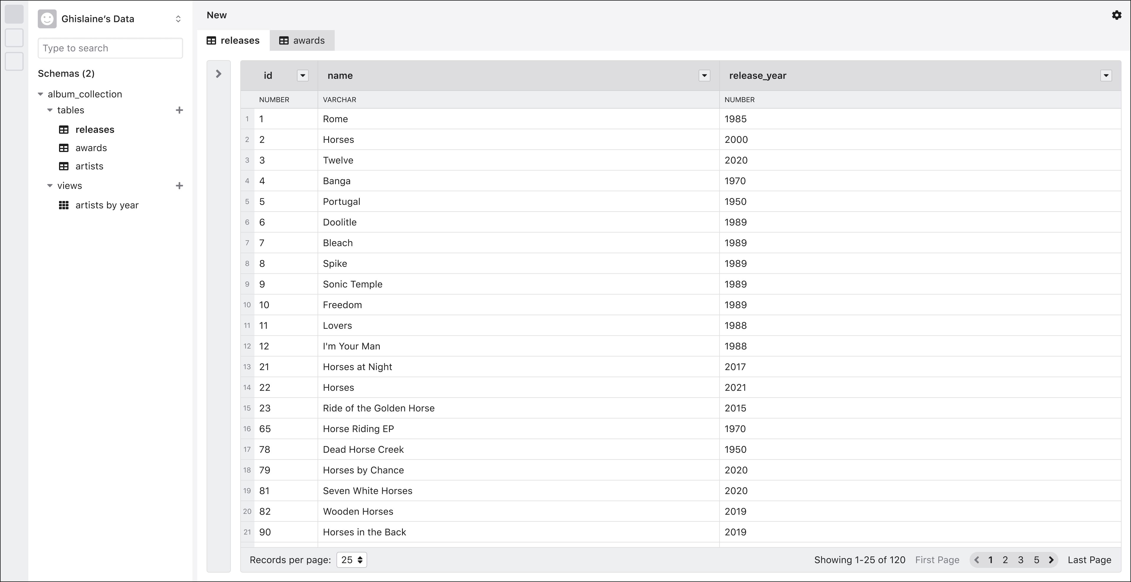
The user clicks the header of one of the columns in the table. A menu becomes visible, and they choose to add a filter to this column.
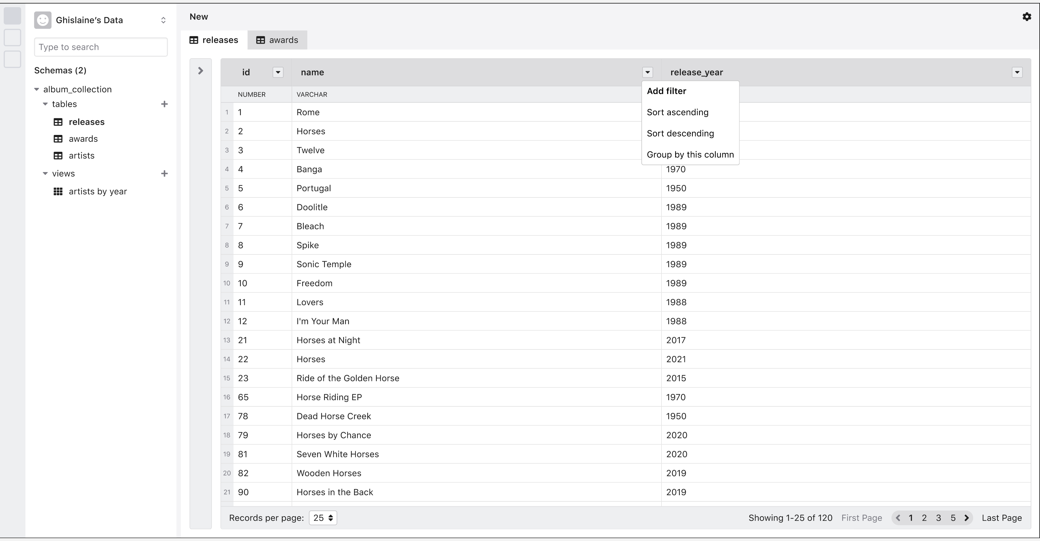
The default filter value is empty. The filtering condition is set to “contains” due to the field type.

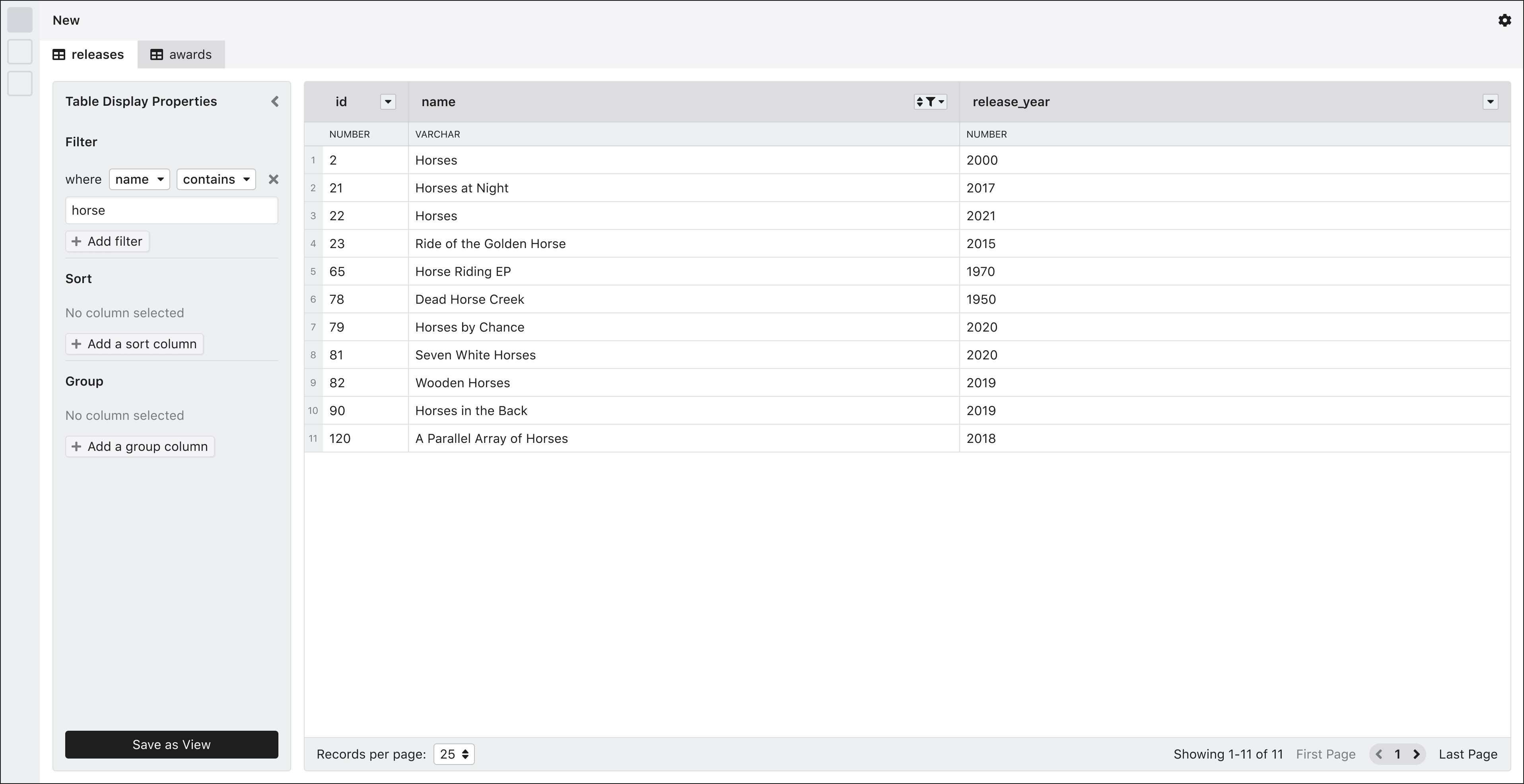
A panel like the one below is displayed next to the table. The filter option is added, and the user can modify it or add more filters.
The initial iteration of this panel won’t have the tables section. The section is included only for illustrating the potential use of the panel as a consolidated query view.

The user now adds a value to the filter, and the table refreshes to show the result. No additional step is required from the user to trigger the table refresh. The value is case-insensitive.
Refreshing Table Data on KeyPress Event
The table should refresh its content based on criteria entered by the user. The input controls should include a loading state that displays after after each keypress. A delay can be set so that the user can type full words without triggering constant reloads.

The user adds a sort rule from the same panel, selects a column, and sets the direction. The table again refreshes to show the updated data.
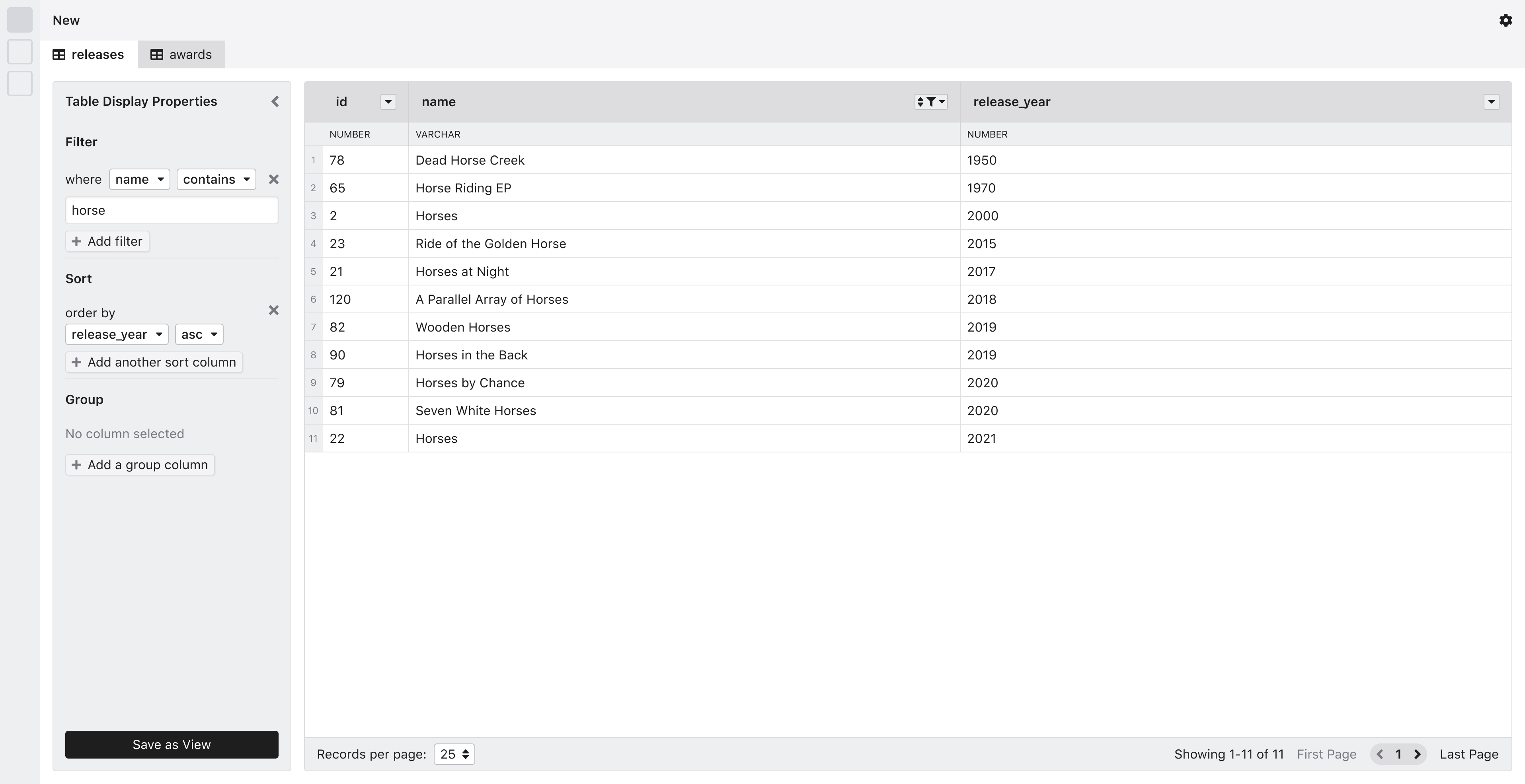
The user now, from the same panel, adds a group column and determines its direction. The group column is highlighted.
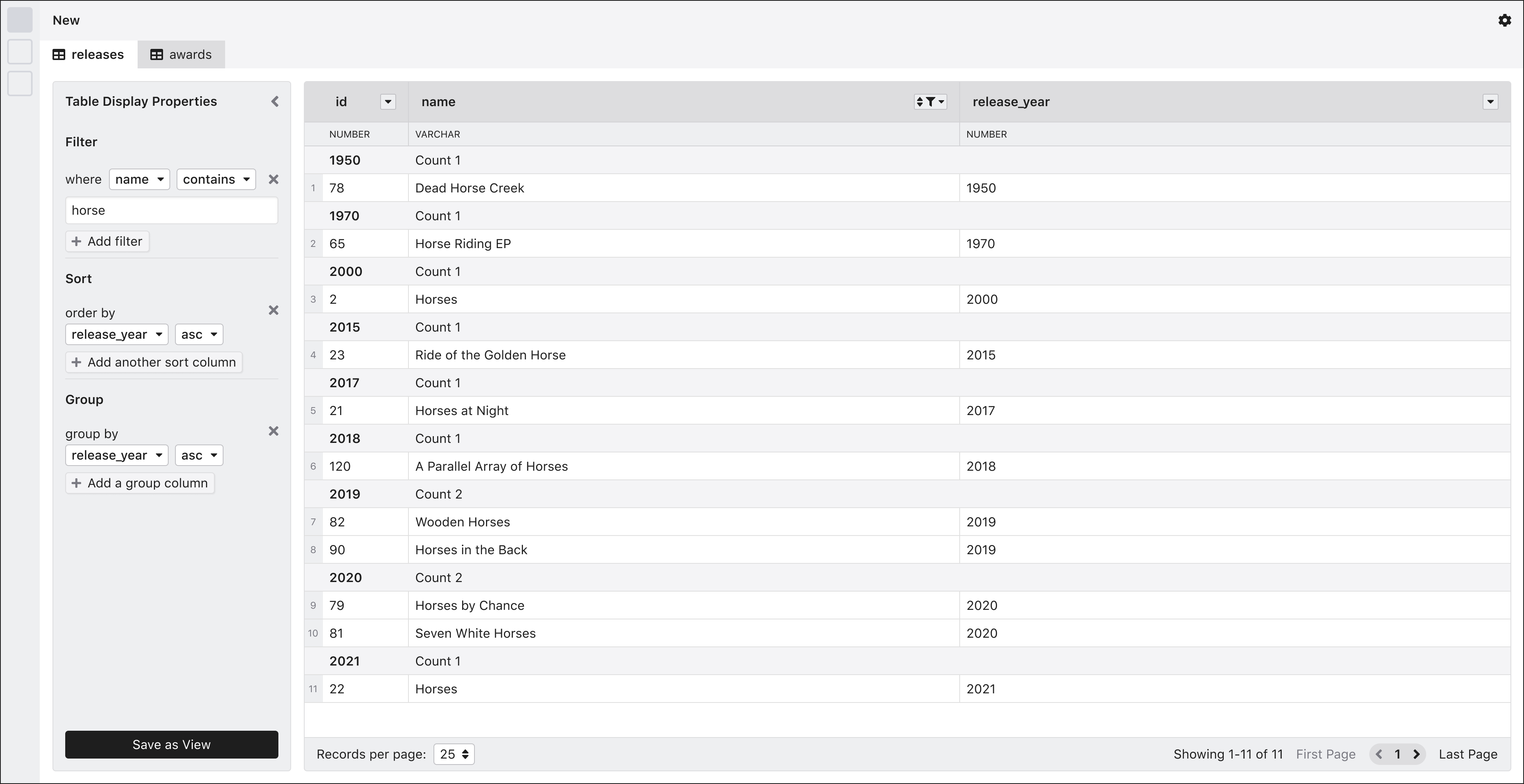
From here, the user should be able to save this as a view.
Scope of Initial Iteration
The initial iteration won’t have any reference to views or table selection.
Interactions
Table Properties Panel
The table properties panel contains the properties of the active table. It opens automatically whenever a new property is added, for example, when applying a new filter from one of the column headers. When closed, the panel stays next to the table in a minified state. It can be reopened if necessary by clicking on it.
States
Open

Closed
Column Selector Controls
Column selector controls are components that apply various properties to columns on a table. They allow users to select a column and set different properties, such as filtering, grouping, and sorting.
On their default state, they display an empty state indicating that no column is selected.

Implementation Notes
Once more options or table properties are available, we can stack icons for displaying different panels like the example below.

Setting a Property
When filter, sort of group properties are added, a default field is set initially to the first column option on the select list.

Changing the column can be done by selecting any of the options from the dropdown menu.


Once the column is set, users can also modify the different filter options. The set of options will depend on the data type of the selected option. If the column is changed to another data type, the UI update with different filter options, and the first one on the list will be chosen by default.

Users can add additional filters by clicking on the “Add Filter” option.

Table Header Controls
In the header area of each table, there are column-specific options in each header cell. Users can access the options by clicking on the buttons. The button content will vary depending on the column status. For example, if a filter is applied, the filter icon will become visible.

Users can access the available options by clicking on the button.

The button will reflect the current column status.

Depending on which option is active, the menu items will change to show other options, such as clearing an active filter. It should be evident to the user that they will clear multiple filters.

User Interface
Read-only Table Updates
Implementing this feature requires specific updates to read-only tables.
Filtered Table
When a filter is active, the table header should provide a visual way of knowing which columns are being filtered.
Sorted Table
When a table is sorted, the table header provides a visual indicator.
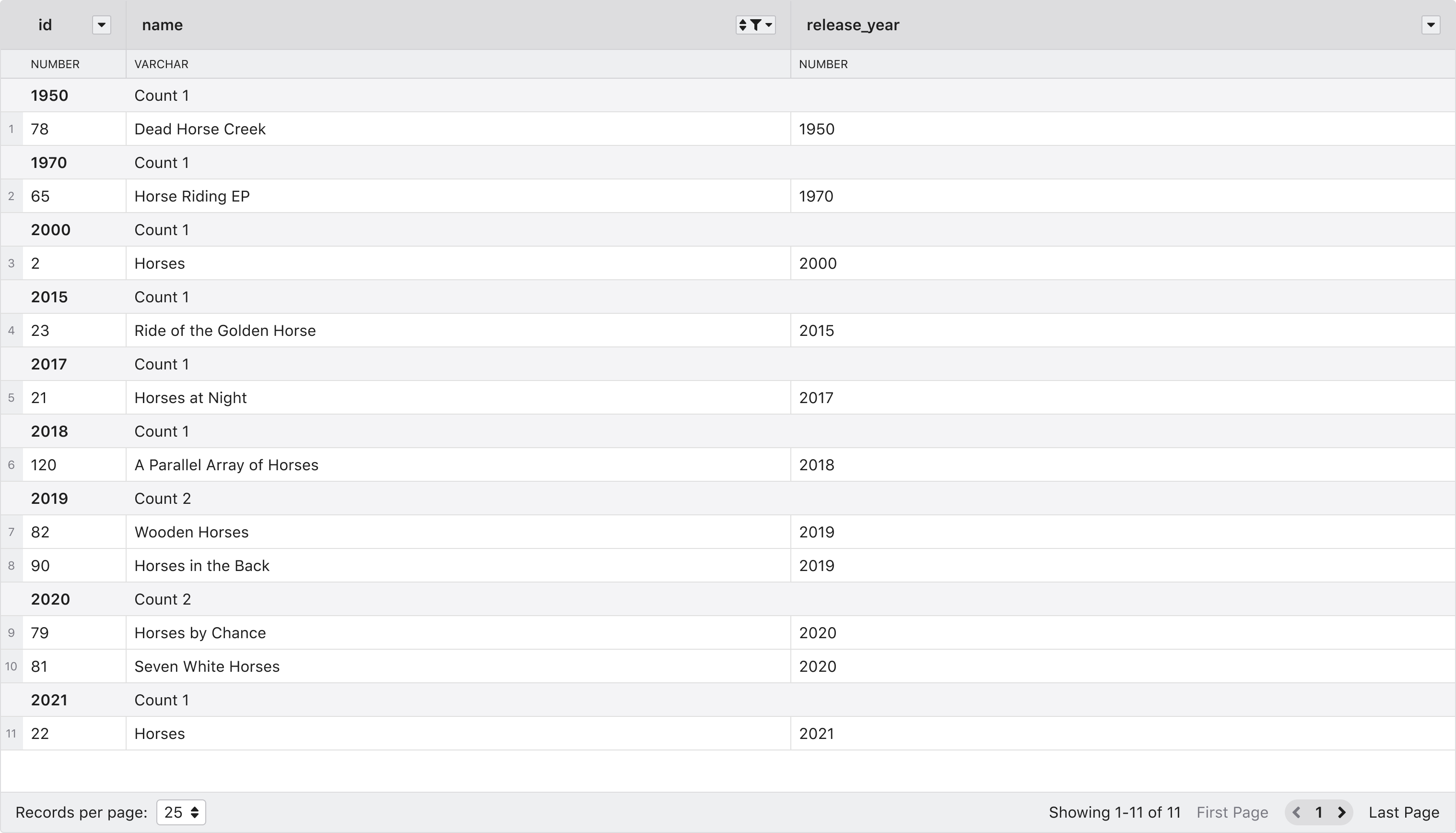
Grouped Table
When a column groups a table, there are grouping elements added to separate the rows. A count of records for each group is available.
Implementation Notes:
- We will create a separate issue to address UI improvements to provide more advanced visual indicators.
Future Iterations: Advanced Filters
Even though the lack of advanced filtering features like filter groups could hinder users’ experience that have more complex needs, we consider that basic filtering covers the requirements outlined by the current use case. Nonetheless, we consider that advanced filtering will be part of the future roadmap.