Record selector UX design specs
Design goals
- The Record Selector allows the user to choose one record from a given table.
- It is used in a variety of contexts throughout Mathesar.
- If the table does not already contain a matching record, then the record selector makes it easy for the the user to create a new record and select it.
Launch contexts
The Record Selector can be opened via the following workflows.
- Cells in FK columns use the Record Selector for data entry.
- Inputs in the following contexts use the Record Selector for data entry.
- Filter condition values, both in table filters and in queries
- Column default values
- Search fields for FK columns within the Record Selector itself (recursively)
- Icon links alongside tables listed for a schema use the Record Selector to navigate to a specific Record Page.
Behavior of data entry components
Record Selector cells and inputs have a large amount of behavior in common, but they’re not identical.
In both cases, the component needs to allow the following actions:
- (A) Launch the Record Selector to set (or update) the value.
- (B) Clear a value already set (making it
NULL). - (C) Navigate to the Record Page for the selected record using a plain
<a>element so that users may copy the link or open it in a new tab. (While this is a strict requirement for cells, it may be okay to forgo navigation from inputs entirely.)
Additionally for cells, the component needs to allow:
- (D) Open custom context menu. (Currently the only entry in this menu is “Set to NULL”, but there will likely be more entries in the menu in the future.)
Mockup of cells and inputs
Cells and inputs can be empty (NULL) or full. And they can be focused (selected in the case of cells), or unfocused. These characteristics lead to eight distinct states, each of which has a design specified below.
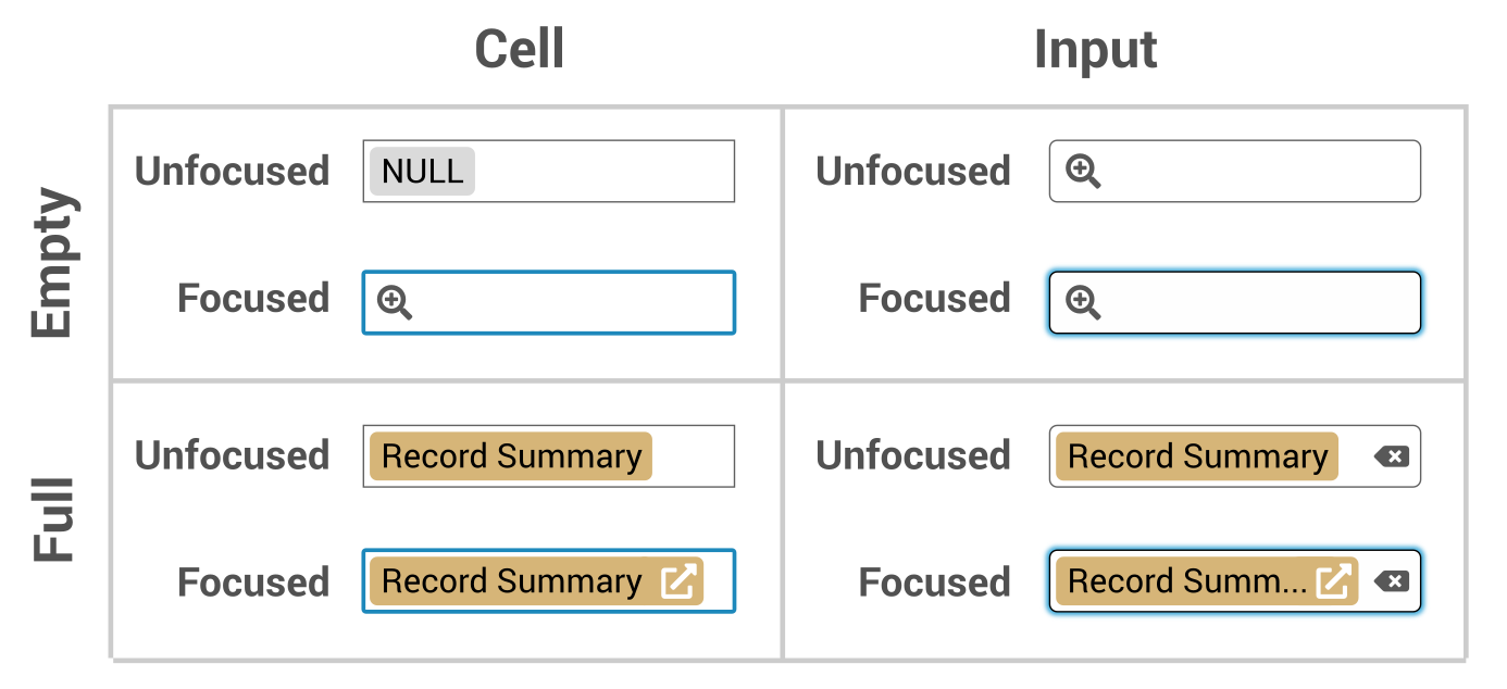
User interactions
-
Via keyboard when focused
Enteropens the record selector.Deleteclears any value set.- (Currently there is no way to perform the navigation action from the keyboard.)
-
Via pointer on the non-icon area
Interaction Operation Click Focus Double click Launch Record Selector Context menu - For cells, opens the custom context menu.
- For inputs, opens the browser context menu.
-
Via pointer on an icon
- The “open Record” icon is an
<a>element. Single clicks navigate to the Record Page in the current browser tab. Context menu or middle click can be used to open in the Record Page in a new tab – even within the cell, where thee non-icon area opens a custom context menu. - The “launch” and “clear” icons are
<button>elements which trigger via a single (or double) click. A context menu event on these buttons will behave as it does in the non-icon area.
- The “open Record” icon is an
Cell context menu entries
The custom context menu for cells contains the following entries:
- Select a
{table_name}Record - Open
{record_summary}
Design considerations and rationale
-
Navigation via icon instead of text
Preliminary designs for this feature had cell which looked more like this:

The idea was that you’d click on the record summary to navigate to the Record Page. The problem with this design is that users may want to open the Record Page in a new tab, but for other functionality we are providing a custom context menu on cells, making that difficult. Using an icon for navigation allows the user to open the browser’s context menu on the navigation link and then open the link in a new tab or to copy the link to the clipboard. The user can still open the custom context menu via the non-icon area within the cell, allowing them to set the value to
NULL, just as they would for any other type of column. -
Double click mistakes
Here’s a problem I’d like to avoid. Consider the following UX design from AirTable

The
xbutton within the record summary (which clears the value) only displays when the cell is selected. That’s nice aesthetically, but it can lead to the user unintentionally clearing the value by double clicking the cell in the area where thexbutton will appear after the first click.Our design has a similar problem, but the result will be unintentional navigation instead of unintentional deletion. I think that might be tolerable. But if it’s not, we could add a small delay for displaying the “open record” icon link.
Behavior after launch
Here’s a “Publications” record selector, as it looks immediately after opening:
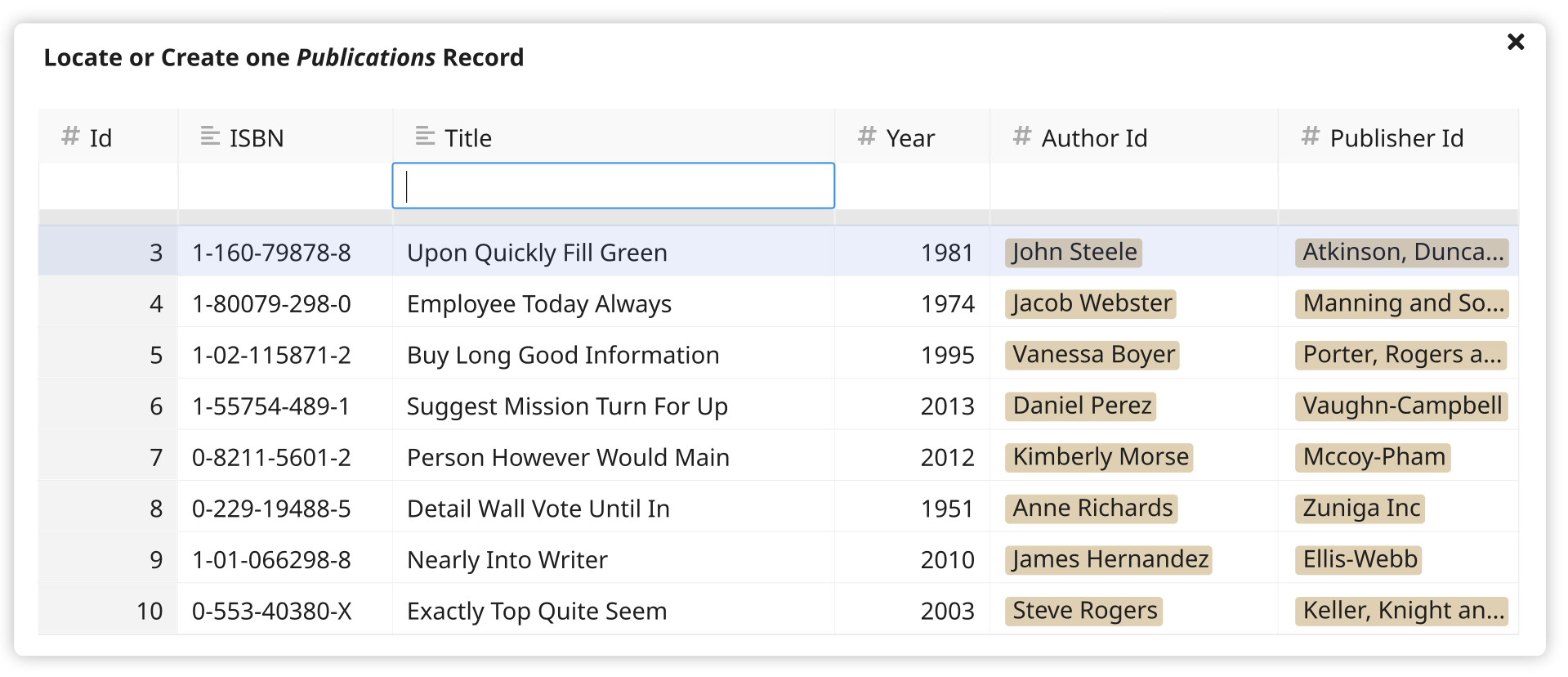
Layout
- It’s a modal.
- Its height grows as needed, but no more than 10 results ever display, making vertical scrolling unlikely.
- If vertical scrolling becomes necessary, then only the results scroll (with the headers and search inputs remaining fixed).
- To account for tables with many columns, the width of the modal should grow as needed until it fills almost the entire viewport width. Even so, horizontal scrolling may be needed in some cases.
Opening
- When a FK cell is selected, pressing
Enteropens the record selector for it. Note: This behavior is consistent with Google Tables, but different from AirTable. For a cell with existing values, AirTable does not open the record selector onEnter, presumably to prevent the user from accidentally overwriting values. I prefer the consistency of Google’s behavior here. - Double-clicking a FK cell opens the record selector for it. (This UX is also more in-line with Google than AirTable.) Note: We could consider adding additional entry points such as an icon click target within blank cell (akin to AirTable), but I think it’s worth exploring those details later.
- The record selector functions identically regardless of whether its origin cell already contains a selected record. This behavior matches Google Tables, but differs from AirTable because AirTable requires the user to manually clear the cell before opening the record selector.
Search inputs
- After opening, the input within the first non-PK column has focus. (And this behavior may actually be a bit more smarter once we have implemented some other features for which I have not yet released specs documents.)
TabandShift+Tabmoves focus between the search inputs.
The “selected option”
- The record selector presents records as “options”, similar to a
<select>element. - One (and only one) option is selected at all times.
- The selected option is styled the same as when a row is selected in a sheet.
- The first row is selected by default.
UpandDownkeys move the selection.- If the user modifies the selection and then modifies the query, the selection is reset to the the first row.
Closing
- Clicking the close button on the modal closes the record selector without producing a record.
- Pressing the
Esckey closes the record selector without producing a record. - Single-clicking on a result closes the record selector, producing the record associated with that result.
- Pressing
Entercloses the record selector, producing the record associated with the currently select option. - When a selection is made, the value of the cell is updated to link to the selected record. When no selection is made, the value of the cell is not changed.
Search algorithm
The search uses some fuzzy logic when finding and sorting records. Here’s how it works:
Overview
- The user enters values into the search inputs exactly as they would enter them into cells within the sheet. For example, a Date type will have a date picker. There will likely be some edge cases here to work out during implementation, especially when dealing with invalid input.
- Records are matched against all query columns using a points system.
- For non-string-like columns (e.g. Number, Date, etc), a record get 4 points per column matched. A match is performed via strict equality.
- For string-like columns, a record gets 4 points for exact matches, 3 points for matches at the start of the string, and 2 points for matches within the string.
- Results are displayed with records listed first that have the highest total points across all query columns.
- Without any search criteria, ten records are displayed, ordered by descending primary key (Note that the mockups herein do not accurately reflect this requirement.)
Example
- Begin with our shared sample data (transformed to the final schema).
-
Add some more data:
-
We are looking for an author named “Anna Rich”. Let’s search the “Authors” table by entering “Anna” into “First Name” and “Rich” into “Last Name”.
-
This produces the following results (with the
pointscolumn displayed here for reference).Id First Name Last Name Website points Anna Rich 276 Anna Richardson 7 277 Anna Wilson-Rich 6 278 Joanna Rich 6 137 Barbara Rich 4 80 Anna Humphrey http://annahumphrey.com 4 6 Anne Richards http://richards.biz 3 39 Michael Richards 3 71 James Richard https://richard.com 3 272 Annabelle Smith 3 274 Adrian Richardson 3 -
We don’t get any exact matches, but the records that match most closely are listed first.
-
The query is run as follows:
WITH anon_cte AS (
    SELECT *,
        CASE WHEN "First Name" ILIKE 'Anna' THEN 4
            WHEN "First Name" ILIKE 'Anna%' THEN 3
            WHEN "First Name" ILIKE '%Anna%' THEN 2
            ELSE 0
        END
        +
        CASE WHEN "Last Name" ILIKE 'Rich' THEN 4
            WHEN "Last Name" ILIKE 'Rich%' THEN 3
            WHEN "Last Name" ILIKE '%Rich%' THEN 2
            ELSE 0
        END
        AS points
    FROM "Authors"
)
SELECT * FROM anon_cte
WHERE points > 0
ORDER BY points DESC
LIMIT 10;
The case statements should probably be wrapped into some db-layer function like
search_score(text, text) -> int, and overloading that would enable scoring other types.
Creating a new record
-
When at least one column contains a query, a “ghost row” will appear above the result set, allowing the user to select a record that will be created on-the-fly using all of the data from their search. The ghost row is filled in as the user types.
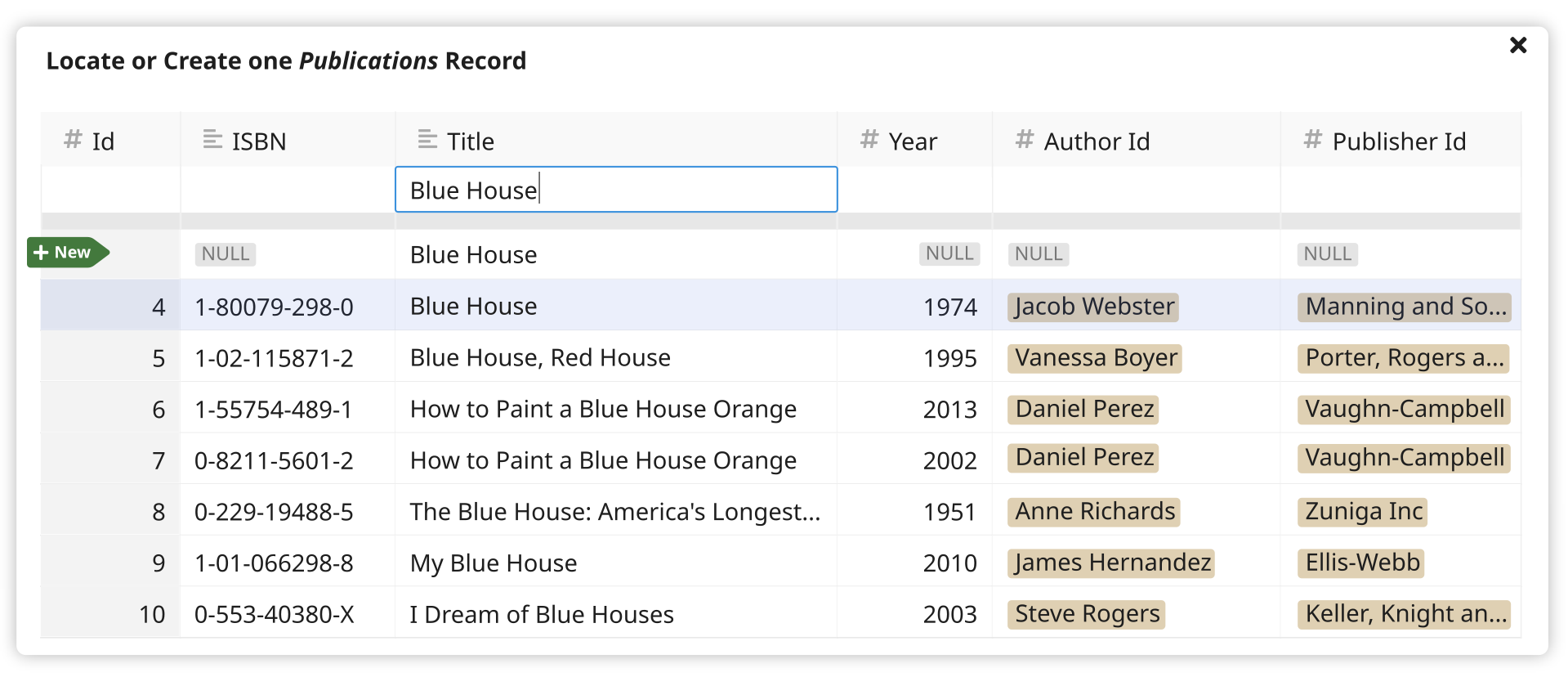
-
The user can highlight the ghost row by pressing
Up– and in this state, validation errors will be displayed for cells as needed using the same UX as when adding a new row to a table.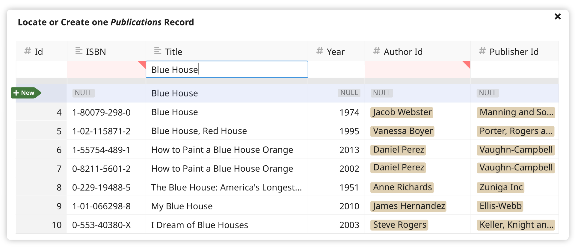
Entering a related record using a nested record selector
-
To create a new Publications record, the user needs to supply an Authors record. They use a “nested” record selector to locate or create one Authors record as follows:
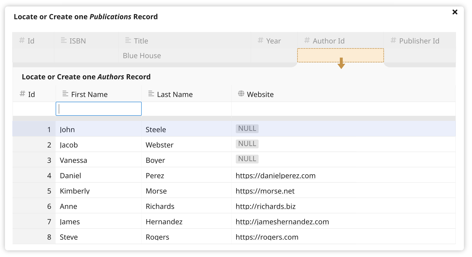
Note: There are some layout details here that will need to be worked out during implementation, such as horizontal scrolling.
-
The nested record selector opens when its target cell is selected (there’s not need to press
Enter), and it closes when a different higher-level cell is selected. There’s no way for it to be closed while its target cell is selected.Note: UX gets a bit weird with tables that only contain FK columns. In the worst case scenario, a table would have only two columns, both of which are FKs. Selecting a record would be impossible because there would be no way to close the nested selectors. In the slightly-better-but-still-bad case, a table contains a PK plus two FKs. Here, you’d need to select the PK cell to hid the nested selectors. These cases are rare enough that I think it’s fine to discount them for now. With some more thought and experimentation, we can detect cases like that adjust the UI behavior a bit to better suit them.
-
After selecting an Authors record, the top-level Publications record selector will become active again, with a value for “Author Id” filled in, and with a string representation of that Authors record displayed in its place.
Unsolved problems
Updating a record before selecting it
Use case…
- I’m entering a new “Items” record.
- For my item, I’m selecting a “Publications” record.
- I’ve found the publication using the ISBN, so I’m confident that it’s the correct record. I’d like to select it!
- But I also notice that the record is missing a “Year” value.
- I can see the year on the book right in front of me so I’d like to update the data, making it cleaner. But I don’t want to lose my place in the process of adding a new “Items” record. I’d like to update the publication year inline before choosing it.
With a little more UX work, I think it would be possible to incorporate an “update” functionality into the record selector.
Locating a record based on aggregate data
Use case…
-
I’ve acquired a new copy of Moneyball by Michael Lewis, and I’d like to enter it as an item.
-
Within the item, I begin to locate or create a “Publications” record. My search looks as follows:
Id ISBN Title Year Author Id Publisher Id Moneyball 91821 0393324818 Moneyball: The Art of Winning an Unfair Game 2004 Michael LewisW. W. Norton Company… … … … … … -
The first result appears to be a match at first, but then I notice that the book I’m holding is the 2011 edition, with ISBN 0393338398. Upon entering those details I see there is no matching record in the database, so I set out to add one by filling in all the fields I can.
-
I need to associate my new Publications record, with an Authors record. Here’s what my Authors search looks like:
Id First Name Last Name Website Michael Lewis 8276 Michael Lewis NULL13901 Michael Lewis NULL… … … … -
Hmmm. There are two Michael Lewis records! Which do I chose? Are they duplicates? I real life, there are actually as many as twenty published authors named Michael Lewis! While picking an Authors record, I want to see a list of books associated with each author.
This is tricky though. The Michael Lewis I’m after has published a lot of books! How will that list of books be sorted? What text will display for each book? (Because the full title of Moneyball is actually quite long.) Can I filter the list? Can I select an author named Michael Lewis who has published at least one book whose title begins with Moneyball??? Designing a UX which helps answer that sort of question (without lots of clicks and keystrokes) is an interesting challenge!
We could also construct a more common use case if we venture outside our example schema. Consider a CRM-like schema with person records which each have many email_address records. When entering an activity record, I want to select a person that has at least one email_address which contains a field that matches a query. And in this case I also want to add a new person with that email address if I don’t find a matching person. Adding is especially tough because we can’t create the email_address record until we create the peron record, so the “drill-down-and-back-up-again” UX outlined in the specs above won’t work for the email_address.
These scenarios are more tricky to handle and will require more UX thought. But for some schemata handling them well will be pretty important.